As a video producer, you know that color plays a crucial role in storytelling. The colors you choose can convey emotions, set the tone, and even guide the viewer’s attention. That’s why understanding color theory is essential for creating impactful videos.
Color theory is the study of how colors interact with each other and how they can be used to create different moods and emotions. Color theory is especially important in film and video production because it can affect how the audience perceives the story and characters. By using color intentionally, you can enhance the visual storytelling and make your videos more engaging.
This article will explore the basics of color theory and how it applies to film and video production. We will cover topics such as color psychology, color harmony, and color grading. By the end of this guide, you will better understand how to use color effectively in your videos and create a more immersive viewing experience for your audience.
Table of contents
Basics of Color Theory
When it comes to film and video production, understanding color theory is crucial to creating visually appealing content. By understanding the basics of color theory, you can effectively communicate emotions and messages through color.
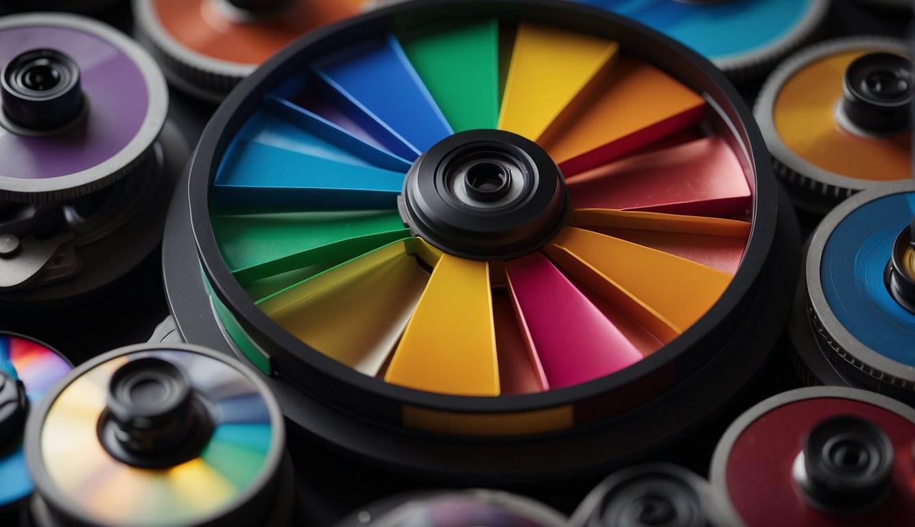
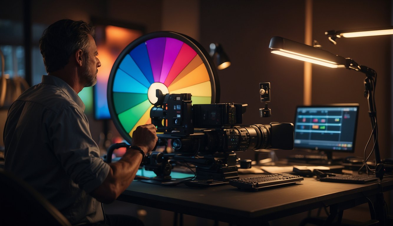
Understanding the Color Wheel
The color wheel is a visual representation of the relationships between colors. It is divided into three categories: primary colors, secondary colors, and tertiary colors.
Primary colors are the building blocks of all other colors and cannot be created by mixing other colors.
Secondary colors are created by mixing two primary colors, and tertiary colors are created by mixing primary and secondary colors.
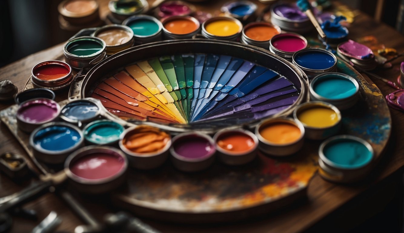
Primary, Secondary, and Tertiary Colors
The primary colors are red, blue, and yellow. Mixing these colors together creates the secondary colors: orange, green, and purple.
Tertiary colors are created by mixing a primary color with a secondary color, such as red-orange or blue-green.
The Role of Hue, Saturation, and Brightness
Hue refers to the actual color, such as red or blue. Saturation refers to the intensity or purity of the color, with fully saturated colors being the most intense and pure. Brightness refers to the lightness or darkness of the color.
By understanding the relationships between colors on the color wheel and the role of hue, saturation, and brightness, you can effectively use color to communicate emotions and messages in your film and video productions.
Color Emotions and Psychology
Color and Emotions
As a video producer, understanding the emotional impact of colors is crucial in creating effective visual content. Colors have the power to evoke different emotions and can influence the mood of the audience.
For instance, red is often associated with passion, love, and danger, while black is often associated with power, elegance, and mystery. On the other hand, white is often associated with purity, innocence, and cleanliness.
It is important to note that the emotional impact of colors can vary depending on cultural and personal associations.
For example, in some cultures, white is associated with death and mourning, while in others, it is associated with purity and new beginnings. Therefore, it is important to consider the context and audience when choosing colors for your video.
Psychology of Color in Film
Colors can also be used to convey psychological themes and ideas in film. For instance, warm colors like red and orange can convey passion, excitement, and energy, while cool colors like blue and green can convey calmness, serenity, and sadness.
In addition, the use of color can also be used to create contrast and highlight important elements in the frame. For example, a bright red object in a predominantly blue scene can draw the viewer’s attention to that object and create a sense of tension or conflict.
Overall, understanding the emotional and psychological impact of colors is an important aspect of video production. By using colors effectively, you can create a powerful visual experience that resonates with your audience.
Color Palettes in Filmmaking

When it comes to filmmaking, color palettes play a crucial role in conveying emotions and setting the mood of a scene.
A well-chosen color scheme can greatly affect how the audience perceives a film. This section will discuss the importance of choosing the right color palette, creating a mood with color schemes, and some film color palette examples.
Choosing the Right Color Palette
Choosing the right color palette is crucial to the success of any film. A color palette is a set of colors used throughout the film to create a specific mood or emotion. Before choosing a color palette, it’s important to consider the genre of the film, the story, and the characters. For example, a horror film typically uses dark and muted colors to create a sense of fear and suspense.
Creating Mood with Color Schemes
Color schemes are the combinations of colors used in a film. There are several types of color schemes, including monochromatic, complementary, analogous, and triadic. Each color scheme can create a different mood or emotion.
For example, a monochromatic color scheme uses shades of the same color to create a calming and peaceful mood.
In contrast, a complementary color scheme uses colors opposite each other on the color wheel to make a sense of tension and conflict.
Film Color Palette Examples
Many films use color palettes to create a specific mood or emotion. For example, the film “The Grand Budapest Hotel” uses a pastel color palette to create a whimsical and nostalgic atmosphere. The movie “The Matrix” uses a green color palette to create a futuristic and technological feel. The film “The Godfather” uses a warm, earthy color palette to create a sense of family and tradition.
In conclusion, choosing the right color palette and color scheme is essential to creating a successful film. By carefully selecting colors that match the genre, story, and characters, filmmakers can make a powerful emotional impact on the audience.
Technical Aspects of Color in Film

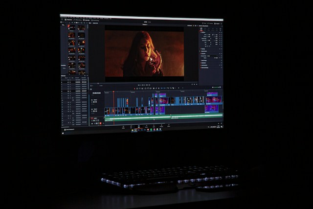
Color Grading and Its Importance
Color grading is an essential aspect of post-production in film and video production. It is the process of adjusting the colors in a video to achieve a specific look or mood. Color grading involves adjusting individual colors’ brightness, contrast, saturation, and hue or the entire video.
Color grading can create a consistent look across different shots, scenes, or entire film. It can also manipulate the colors to convey a specific emotion or feeling. For example, warm colors like red, orange, and yellow can create a feeling of happiness, excitement, or danger, while cool colors like blue and green can create a feeling of calmness, sadness, or mystery.
In addition to creating a specific look or mood, color grading can correct color imbalances caused by lighting, camera settings, or other factors. For example, if a shot appears too blue due to the lighting, color grading can be used to adjust the colors to make it look more natural.
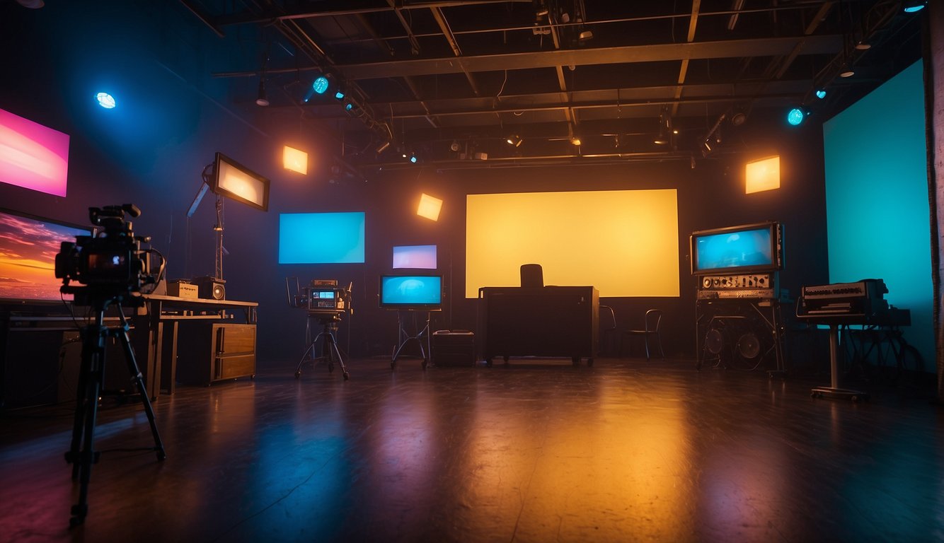
The Impact of Lighting on Colors
Lighting is a crucial factor in how colors appear in film and video. The light source’s color temperature can affect the scene’s colors. For example, a warm light source like an incandescent bulb can make colors appear more yellow or orange, while a cool light source like a fluorescent bulb can make colors appear more blue or green.
The direction and intensity of the light can also affect the colors in the scene. Shadows can create contrast and depth, while highlights can make colors appear brighter and more vibrant.
When shooting a scene, it is essential to consider the lighting to ensure that the colors appear as intended. A colorist can also adjust the colors during the color grading process to achieve the desired look.
In conclusion, understanding the technical aspects of color in film is crucial for achieving your video production’s desired look and mood. Color grading and lighting are essential factors that can affect the colors in the scene and should be considered during the production and post-production process.
Advanced Color Concepts

As a video producer, you already know the basics of color theory and how to use it to create a mood or convey a message. It’s time to take your color game to the next level with advanced color concepts.
Complementary and Analogous Colors
Complementary colors, such as red and green, are opposite on the color wheel. When used together, they create a high contrast and can evoke a sense of tension or conflict. On the other hand, analogous colors, such as blue and green, are next to each other on the color wheel. When used together, they create a harmonious and cohesive color scheme.
Consider using complementary colors to create a dramatic effect in a scene, such as a fight scene or a heated argument. Analogous colors can create a calming and peaceful atmosphere, such as in a nature documentary.
Monochromatic and Triadic Color Schemes
A monochromatic color scheme uses variations of a single color, such as different shades of blue. This creates a sophisticated and elegant look. A triadic color scheme uses three colors, red, yellow, and blue, evenly spaced on the color wheel. This creates a vibrant and dynamic look.
A monochromatic color scheme creates a sense of continuity and uniformity in a scene, such as in a corporate video. Use a triadic color scheme to create a visually interesting scene, such as in a music video.
Using Discordant and Associative Colors
Discordant colors are colors that clash with each other, such as pink and orange. When used together, they create a jarring and unsettling effect. Associative colors are colors that are associated with a particular mood or emotion, such as red for passion or blue for calmness.
Consider using discordant colors to create a sense of unease or tension in a scene, such as in a horror movie. Use associative colors to reinforce a particular mood or emotion, such as in a romantic comedy.
Incorporating these advanced color concepts into your video productions can elevate your visual storytelling and create a more impactful and memorable experience for your audience.
Color in Film Genres and Styles

Color in Different Film Genres
Color plays a crucial role in setting the tone and mood of a film. Different genres of films use different color palettes to convey emotions and create a particular atmosphere. For instance, horror films often use dark and desaturated colors to create a feeling of unease and suspense. On the other hand, romantic comedies use bright and warm colors to create a cheerful and romantic ambiance.
Action films often use bold and vibrant colors to convey a sense of excitement and energy. For example, the movie “Fast and Furious” is known for its use of bright colors and neon lights to create a high-octane atmosphere.
Signature Styles of Renowned Directors
Renowned directors often have a signature style reflected in the color palettes they use in their films. For instance, David Fincher is known for using desaturated colors and green tones in his movies, such as “Fight Club” and “The Social Network.” This color palette creates a gritty and moody atmosphere characteristic of his films.
Similarly, Quentin Tarantino is known for using bold and vibrant colors, such as in “Pulp Fiction” and “Kill Bill.” This color palette creates a unique and stylized atmosphere that is a signature of his films.
In Hollywood, color grading is an essential part of the post-production process, and colorists work closely with directors and cinematographers to create the desired look and feel of the film. The use of color in film is a powerful tool that can convey emotions, set the tone, and create a unique atmosphere characteristic of the film’s genre and director’s style.
Practical Application of Color Theory
When it comes to applying color theory in your film and video projects, there are several key areas where you can make a real impact. You can create a cohesive and visually engaging final product by developing a color strategy for your project, incorporating color in set design and wardrobe, and utilizing case studies of successful color storytelling.
Developing a Color Strategy for Your Project
Before you begin shooting, developing a color strategy for your project is important. This involves considering the overall mood and tone you want to convey and the emotional impact you want your audience to feel. By selecting a color palette that aligns with your project’s goals, you can create a more visually cohesive and emotionally resonant final product.
To develop your color strategy, consider the following:
- Storytelling: What emotions do you want to evoke in your audience? How can color help you achieve this?
- Design: What colors are associated with your brand or project? How can you incorporate these colors in a natural and cohesive way?
- Business: What colors are associated with your industry or target demographic? How can you use color to appeal to your audience?
Incorporating Color in Set Design and Wardrobe
Once you have a color strategy, it’s important to incorporate color into your set design and wardrobe choices. This can help create a more visually engaging and immersive experience for your audience.
Consider the following when incorporating color:
- Color Harmony: Use color theory to create a harmonious color palette that feels cohesive and visually pleasing.
- Creativity: Don’t be afraid to experiment with color and push boundaries to create a unique and memorable visual experience.
- Science: Consider the psychological impact of color on your audience and how it can be used to convey emotion and meaning.
Case Studies: Successful Color Storytelling
Finally, looking at case studies of successful color storytelling in film and video can be helpful. This can provide inspiration and guidance as you develop your color strategy and incorporate color into your project.
Consider the following case studies:
- The use of blue in The Matrix conveys a sense of coldness and artificiality.
- The use of red in Schindler’s List symbolizes the bloodshed and violence of the Holocaust.
- The use of yellow in Kill Bill creates a sense of energy and excitement.
By studying these examples and applying the principles of color theory to your work, you can create a more visually engaging and emotionally resonant final product.